
The design approach began with the idea of mitosis — the biological process of cell division and regeneration. This became the conceptual foundation for the identity, symbolising life, growth, care, and continuity. This idea was further extended into a graphic pattern inspired by the mitosis of cells. Circular forms, repetitions, and subtle variations were used to create a visual language that suggests regeneration and movement without becoming visually overwhelming.
Name
IVF Clinic Branding
Year
2021
Typology
Location
The design approach began with the idea of mitosis — the biological process of cell division and regeneration. This became the conceptual foundation for the identity, symbolising life, growth, care, and continuity. This idea was further extended into a graphic pattern inspired by the mitosis of cells. Circular forms, repetitions, and subtle variations were used to create a visual language that suggests regeneration and movement without becoming visually overwhelming.

The logo was developed as an abstract representation of a mother and child, reflecting the hospital’s nurturing ethos and its focus on compassionate care. Its soft, fluid form moves away from the rigidity often associated with medical spaces, creating instead a sense of warmth, reassurance, and emotional connection.
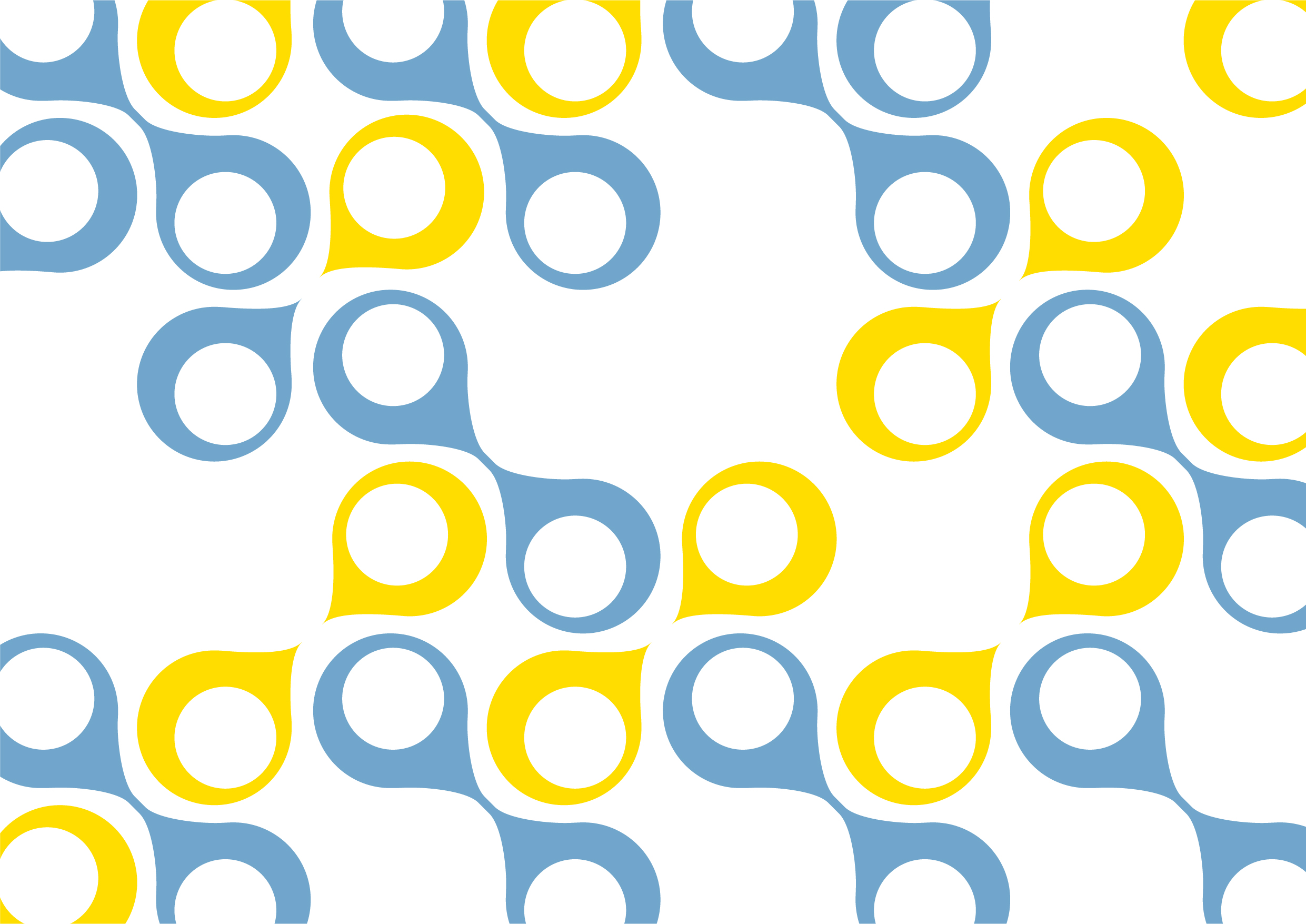
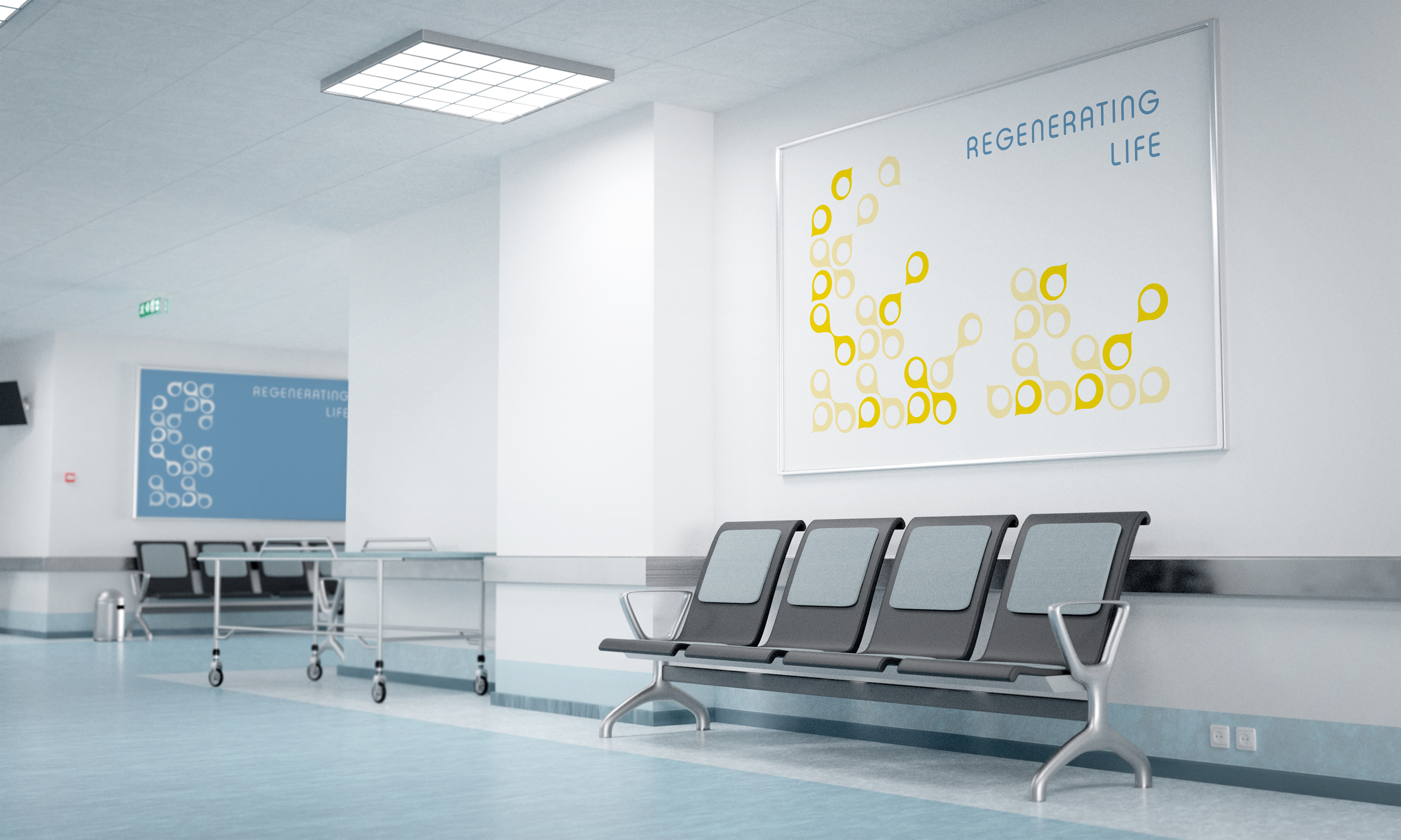
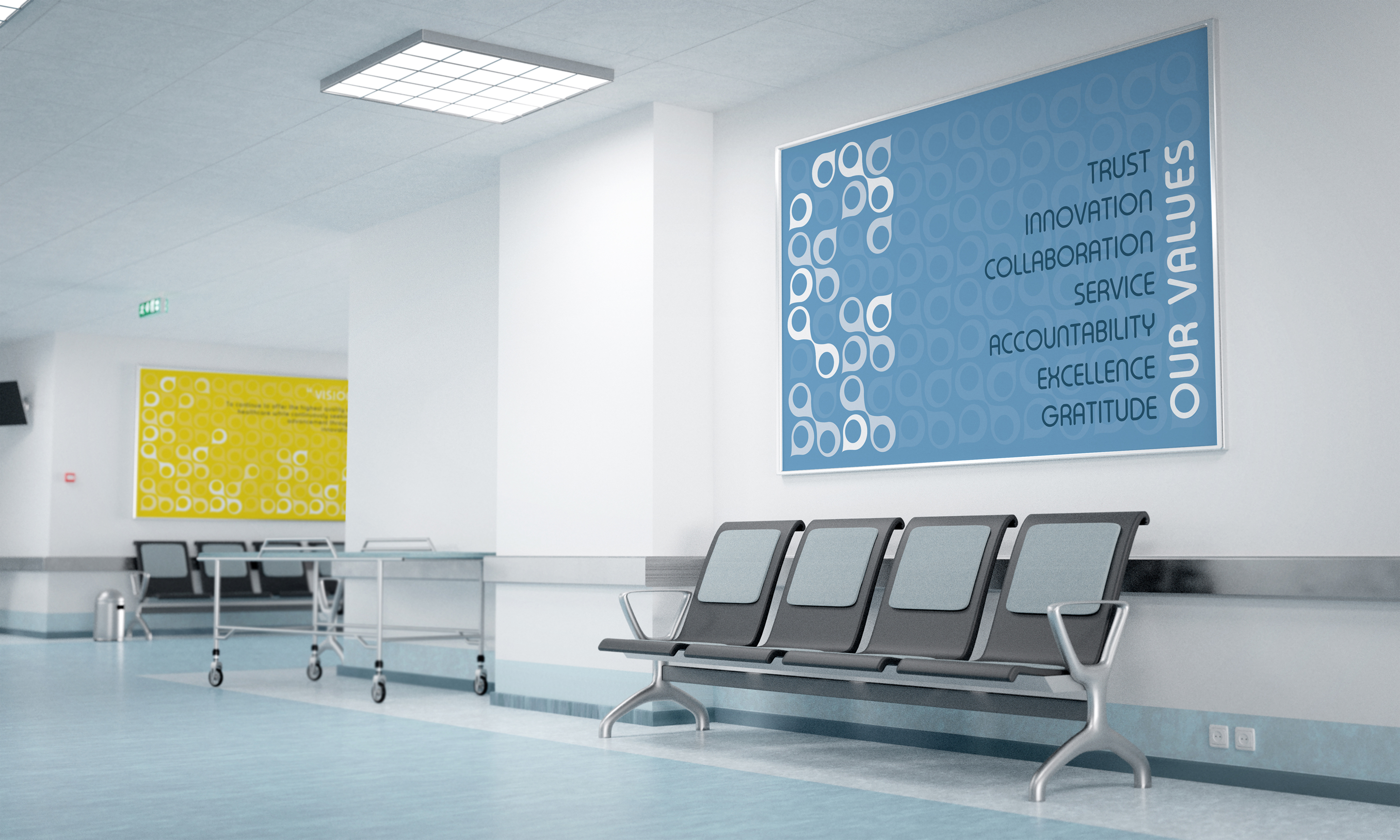
The pattern was then adapted across multiple applications, including banners, window films, signage, and environmental graphics.
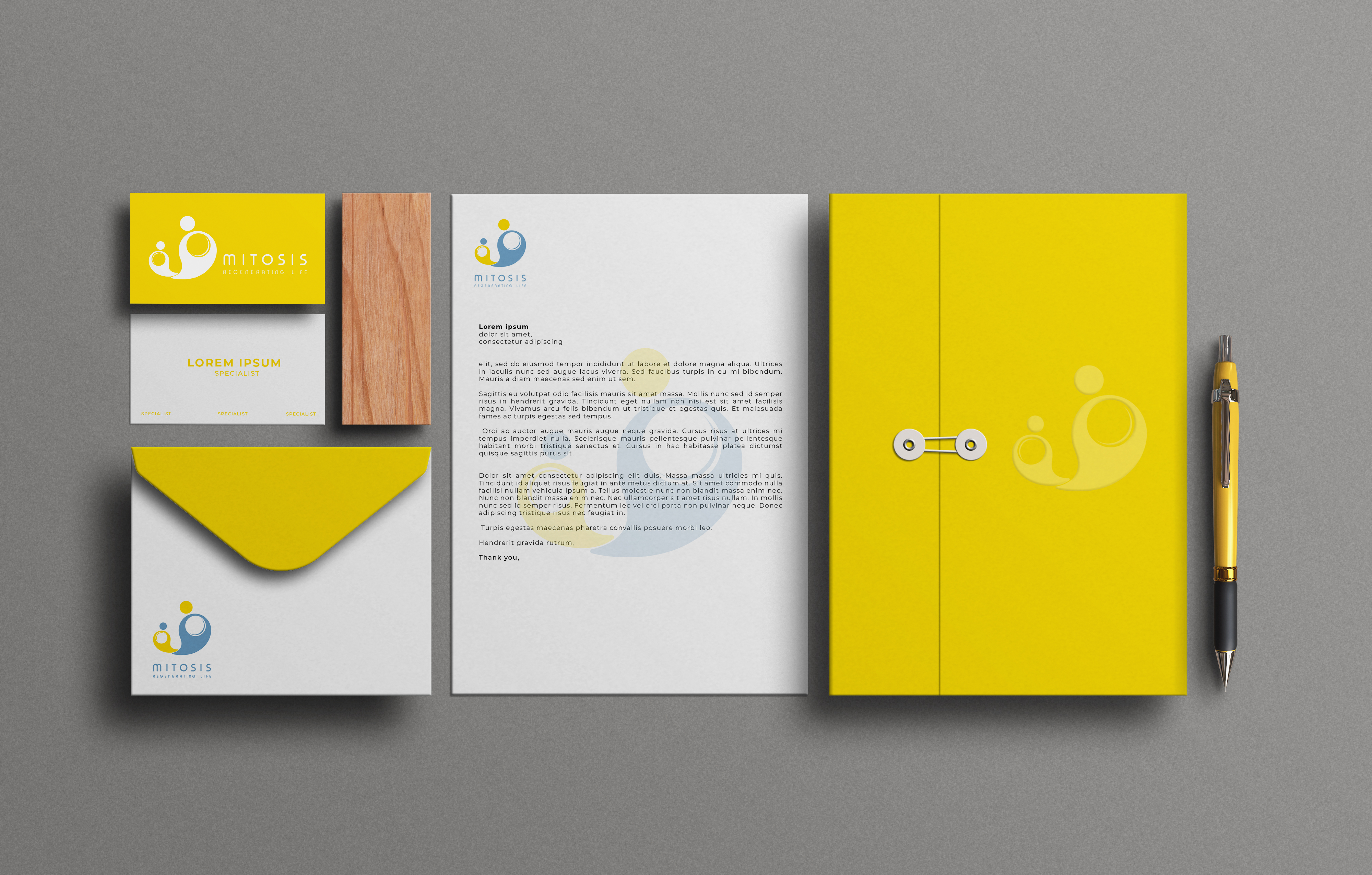
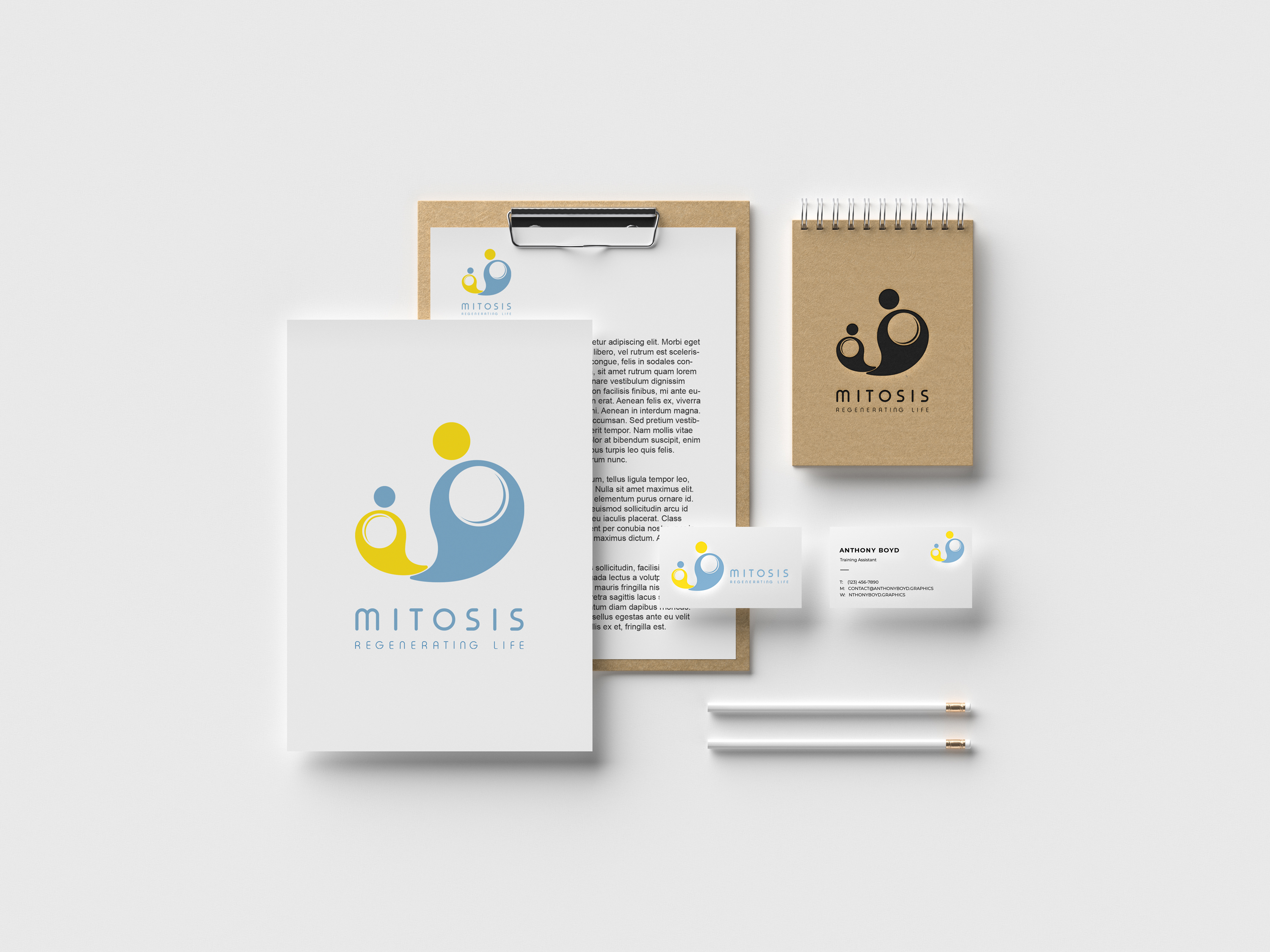
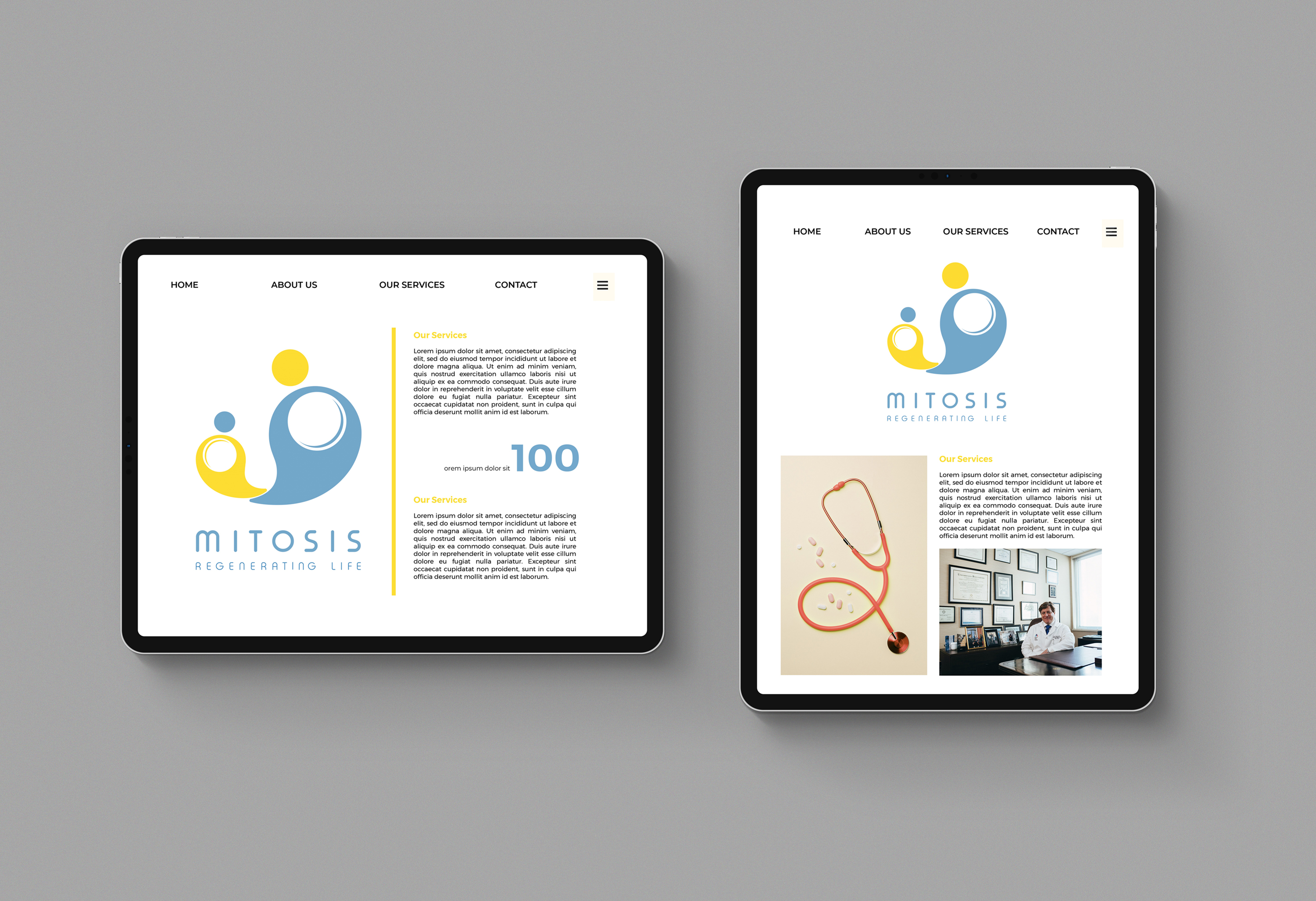
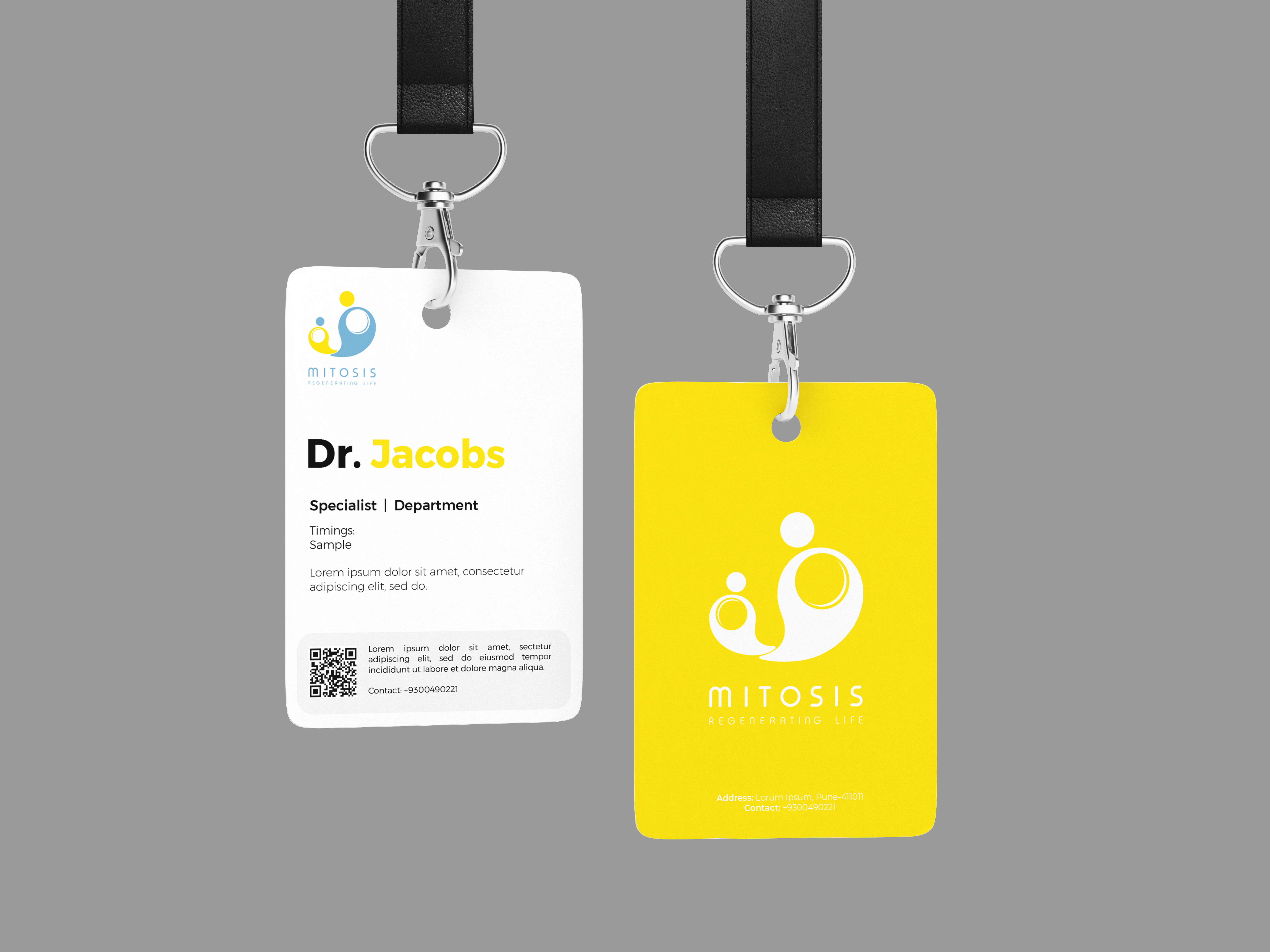
A palette of cool tones was chosen to complement the interiors and create a calm, composed atmosphere. Shades of blue, yellow, and soft neutrals were used strategically to balance clinical clarity with warmth and optimism. These colours helped bring consistency across the hospital’s visual elements while also supporting the functional needs of privacy, wayfinding, and spatial definition.
Since 2019